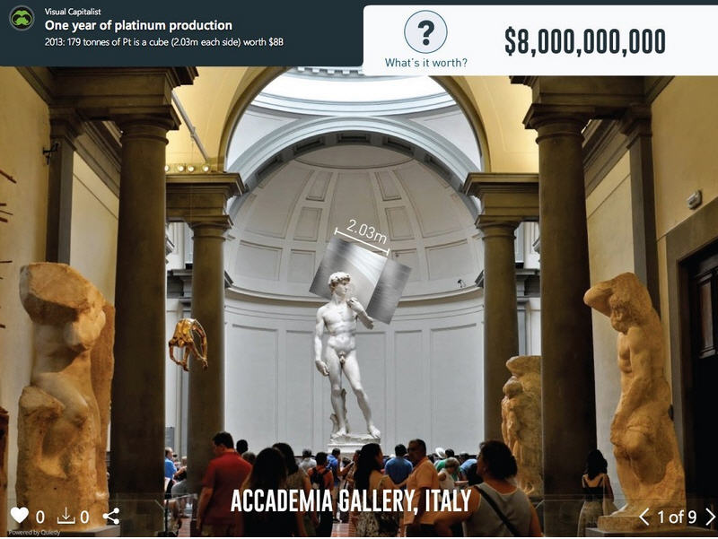
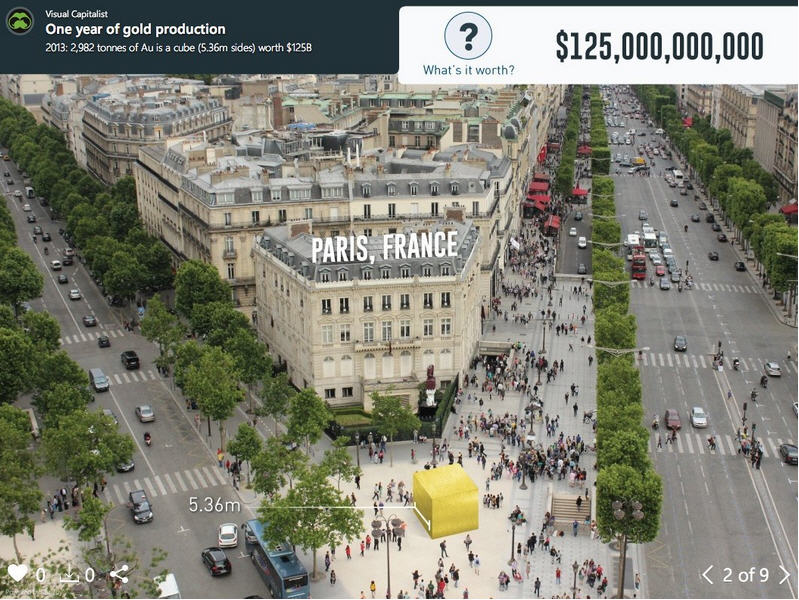
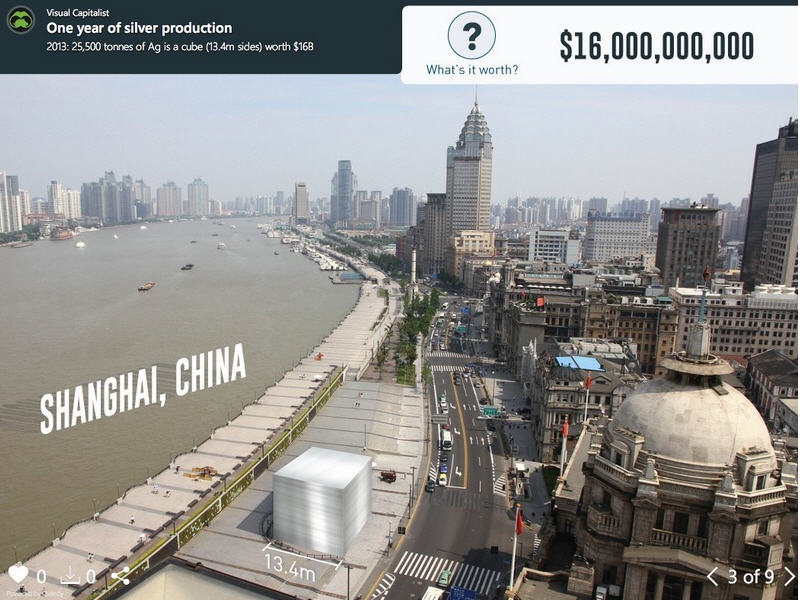
A year's extraction of metal shown next to landmarks and cities - Visual Capitalist | September 25, 2014
For thousands of years of development as a species, humans never really needed to understand the real meaning behind big, unreachable numbers such as billions or trillions. As a result, even today we have difficulty imaging what these seemingly abstract numbers represent.


This is why visualization can be such a powerful tool. Instead of dealing with zeroes, we get to actually see these large numbers applied in a way that we can relate to. In the above slideshow visualization, we have taken the annual production of eight major commodities (platinum, gold, silver, uranium, nickel, copper, iron, and oil) and imagined that we could lump them together into a large 3d cube. Then, we put the cube within context of a visual scene that we can contrast them with. In this case, famous landmarks and cities. Some cubes, such as platinum’s, are only the size of a Volkswagen. Others, such as oil, are kilometres on each side and span blocks of major cities.
Read More: www.mining.com/web/infographic-a-years-extraction-of-metal-shown-next-to-landmarks-and-cities/