MUST SEE CHART: Something Quite Interesting Happened In The Silver Market
Precious Metals by SRSrocco
While analysts and investors are familiar with the data put out by the Silver Institute and World Silver Surveys, we can see an entirely different picture when we combine the figures in a certain way. What I am trying to say here is this… by crunching the official data (even though it might be understated or manipulated) we can see very interesting trends that aren’t noticeable when looking at the individual figures.
This is one of the more important analytic tools I like to use at the SRSrocco Report. By crunching the numbers and looking at figures in a certain way, I can see certain trends that may not be apparent to most investors.
Before we look at the chart that (I believe) proves investors have become increasingly fearful of the paper markets, let’s look at the chart below. This chart shows the difference between the build of Silver ETF inventories versus Silver Coin and Bar investment demand:
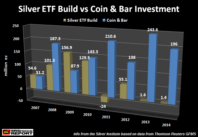

As we can see, Silver ETF inventories and Silver Coin & Bar demand both increased after the collapse of the U.S. Investment Banking System and Housing Market in 2007. Global Silver ETF’s saw their inventories increase from a build of 54.6 million oz (Moz) in 2007 to 156.9 Moz in 2009. While physical Silver Bar & Coin demand increased from 51.2 Moz in 2007 to 187.3 Moz in 2008, it fell nearly 100 Moz in 2009 to 87.5 Moz.
For whatever reason, Global Silver ETF inventories increased in 2009, even though the average annual price of silver fell to $14.67 compared to $14.99 in 2008. When the price of silver jumped to an average of $20.19 in 2010, the build of Global Silver ETF inventories fell to 129.5 Moz (compared to 156.9 Moz in 2009), while demand for Silver Bar & Coin increased to 143.3 Moz.


